Strategy
Jun 27, 2022
How to Make the Process of Design (Not Just the End Product) Accessible

Did you know accessibility is best addressed at the foundation of any product and not as a tacked on feature? — Every Blog on Accessibility since 2016
Sure: Accessibility is now a critical part of design (as evidenced by the growing number of executives listing it as a foundational requirement for any new product), as it should be. But stick with me, this isn’t just another piece talking about the importance of accessibility. There’s a little talked about gap in the actual process of getting to an accessible product, and it’s a big one.
Redefining the Scope of Accessibility Work
Last year, I came across an accessibility issue I hadn’t thought of or encountered before. I asked my colleagues about it and scoured the web, but no luck. There simply weren’t any resources out there addressing this issue. All I found was a dozen variations of the above sentiment (which is something I certainly agree with).
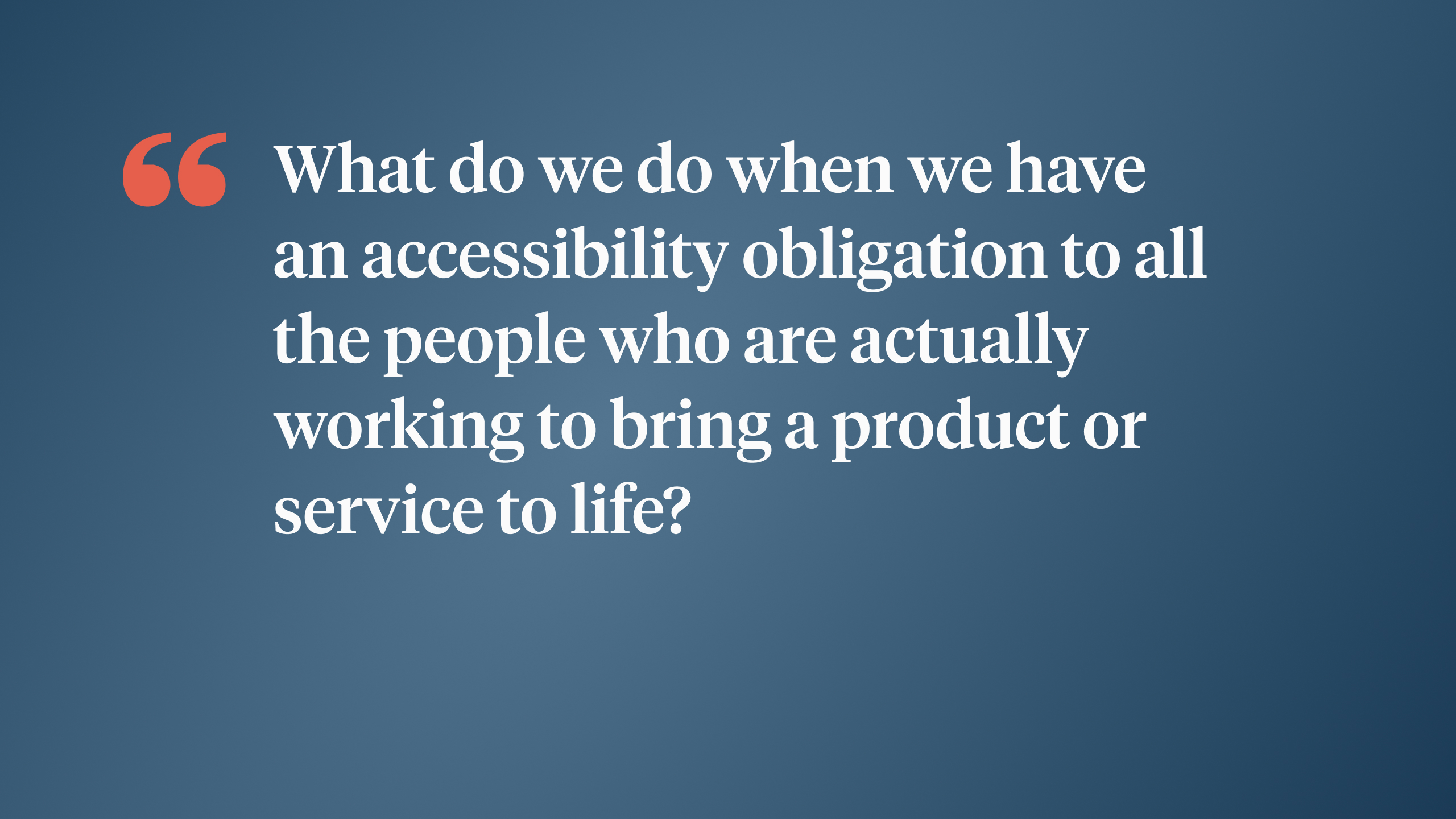
The issue wasn’t related to designing a product that would be accessible for end users; we were partnering with internal collaborators with accessibility needs. This posed a larger question: What if our job as designers is not just ensuring accessibility is part of the end product, but also that it’s central to the processes and deliverables that get us to that end product? What do we do when we have an obligation to all the people who are bringing a product or experience to life?

I’ll admit, my knee-jerk reaction to this question was, “No, the efforts of designers, developers, product managers would be wasted if they were not solely focused on the end user.” After all, we just spent three weeks in discovery learning about the end user and the end product is the thing that will actually have a price tag on it. This line of thinking is problematic, however, because it means that, even though everyone can use the end product, only certain people get to build it.
Designing Artifacts for Accessibility
This came up when a contributor on my team raised a concern about visual-impairment accessibility. At first, I thought this was in reference to the implementation of the designs and started rattling off the common considerations (i.e., contrast, tab order, alt text). But the problem wasn’t with the implemented designs but with the design artifacts themselves.
We had created a variety of deliverables (user personas, user flows, low/high-fidelity designs) but these files simply didn’t work for those with visual impairments. Our high-fidelity designs might do just fine on a webpage where text and images are live and work with accessibility tools, but for the time being we were stuck with flat visual images.
I first looked to the suite of tools we were using to create the designs, but all of them failed to provide sufficient accessibility features. In fact, in my search for solutions I found this was an industry-wide problem, according to the Rochester Institute of Technology.
The lack of visual accessibility in these tools creates a barrier for designers who may use screen readers, such as those who are vision impaired.
In addition, their recommendations prioritize “improved accessibility for input and control instruction, alternative text, focus order, canvas element properties, and keyboard operations,” the exact capabilities I was lacking with our current toolset. Still, there had to be some bootstrap solution to get our visual designs into a digestible format.
As you might guess, there was no perfect solution, but we did come up with some compromises and stopgaps to ensure all parties could participate in the process. I’ll share these solutions, but what I think is more valuable is showing our process, refined and streamlined, so you can effectively design accessible products in an accessible way. We found three key principles to be critical to finding a solution:
Identifying the Project’s Accessibility Needs
Mapping and Evaluating Your Design Workflow
Making Adjustments
1. Identifying the Project’s Accessibility Needs
Our process to identify accessibility needs is a little different from our normal process of identifying the accessibility standards we aim to achieve with an end product (i.e., WCAG AA standards). This is because our accessibility standards may not translate directly to the medium of every single design artifact. For instance, the accessibility need for webpage landmarks doesn’t really apply to flat images like mood boards, wireframes, or high-fidelity designs, as these artifacts are not interactive by nature. Instead, we need to come from the other end of the accessibility conversation and identify the needs of the team.
Here's how:
Don’t make assumptions. Consult with everyone on the team to gather a comprehensive list. Doing this on an individual level can help reduce any fear team members might have of troubling the group with their own personal needs. Later, if others question your accessibility efforts, you will have evidence of the need and proof of how it will impact the end product.
Focus only on the needs raised by the team. It would be a shame to go through all this effort of getting an artifact to work with text-to-speech tools when no one on the team needs this functionality. They are, in fact, just a means to an end.
Don’t worry about “future proofing” artifacts. The team and needs may evolve, but really artifacts are just ways to communicate design intention. Once they’ve been implemented, they’re just that, an artifact—as in, a byproduct of a particular period or process, rather than an end product.
2. Mapping and Evaluating Your Design Workflow

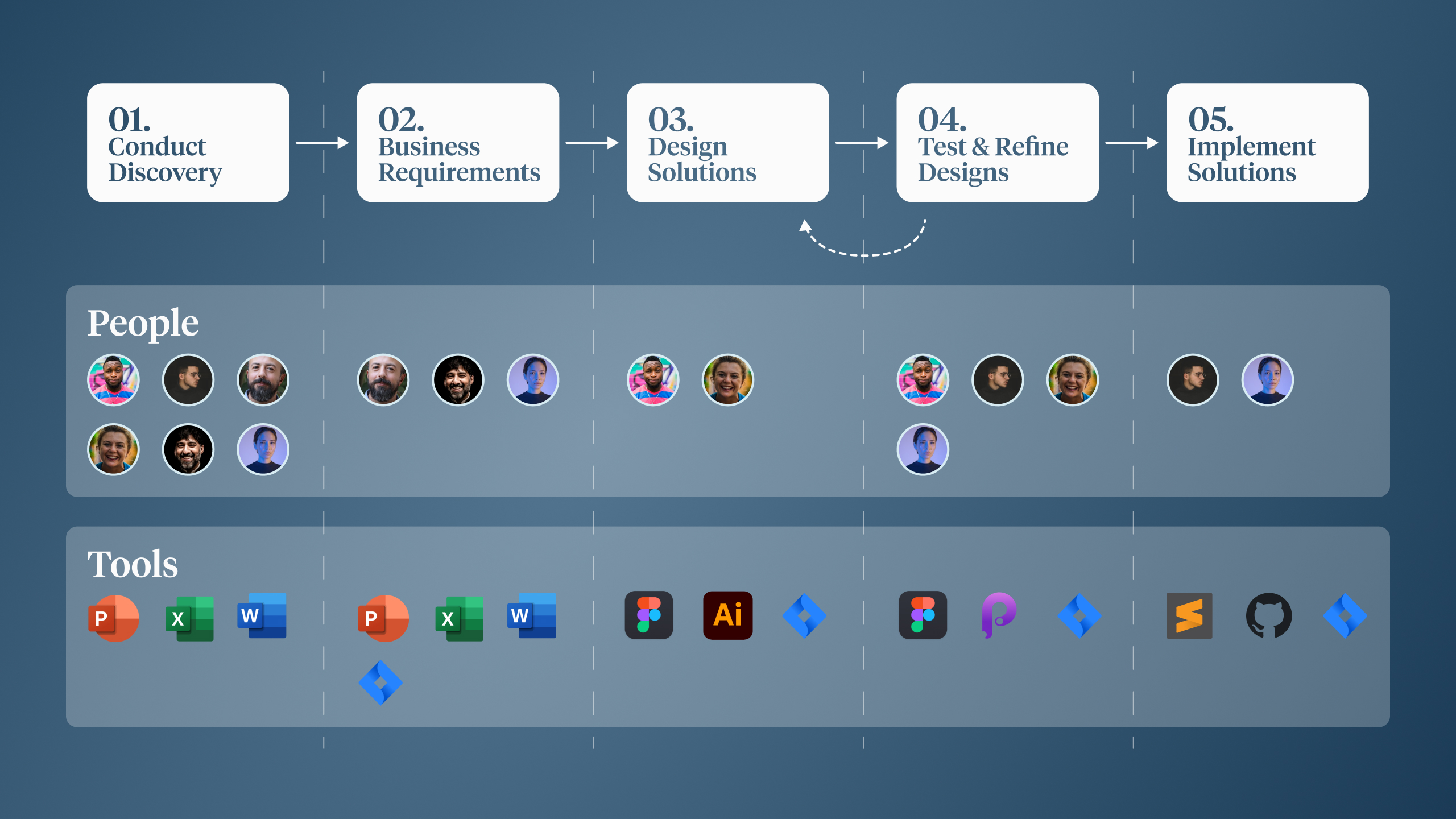
To understand where your team’s needs are not met, you need to first map out your current workflow and identify a few key components like those shown in this simplified illustration.
The steps
The people at each step
The tools
The tools at each step
With an accurate map of your team’s overall process, you’ll begin to see where issues might arise. As particular team members come into the process, you can ensure the tools and deliverables produced match that team member’s accessibility needs. This is critical because solutions will only be necessary at the exact moment of need, not throughout the entire process.
For example, you may have a stakeholder with a slight visual impairment who comes in toward the end of the workflow to provide feedback and approve designs. In this case, there is no need to make accommodations during discovery or while you’re designing. But when it comes time to incorporate stakeholder feedback, you can then pivot quickly to exporting your artifacts in a way that conforms to their needs.
This keeps the iterative process lightweight while still allowing all parties to contribute.
Through this evaluation you’ll now have a precise understanding of the needs to be met at each step and with each tool.
3. Making Adjustments
Depending on your specific needs and the steps and tools you need to create accommodations for, this aspect can be fairly tough. If most of the needs arise in steps that include widely used tools such as Word or PowerPoint, you will have a lot of accessibility accommodations built into the tool. However, if your needs exist within more specialized steps, such as creating the actual design solutions, you might have little room for adaptation.
Such was our case when we needed the ability to translate high-fidelity designs into accessible formats for review before they could be handed off to developers. Given the visual nature of vector programs such as Figma, the artifacts generated had little metadata to be read by accessibility tools. Even though they have layers of components and assets, they are, in essence, just pictures.
To create an accessible solution, we ran through a variety of workarounds and evaluated their effectiveness versus the resources required. Here is a quick look at the solutions we explored.
❌ PDF Exports via Figma:
Difficulty: High
Estimated additional hours per sprint: 40
Effectiveness: Low
❌ Exported PowerPoint Files
Difficulty: High
Estimated additionally hours per sprint: 40
Effectiveness: Low
❌ Zeplin Handoff
Difficulty: Low
Estimated additional hours per sprint: 2
Effectiveness: Low
❌ HTML Webpage Export
Difficulty: High
Estimated additional hours per sprint: 30
Effectiveness: Moderate
✅ 4X High-Fidelity Export With OCR Tool
Difficulty: High
Estimated additional hours per sprint: 5
Effectiveness: Moderate
Viewing Your Team as the Secret to Success
This is all easier said than done. As you can see, this approach involved a lot of trial and error. I began the process by thinking about the quickest way to satisfy the requirement. When that didn’t work, I then spent too much time manually configuring and altering the designs to fit specific tools, such as Adobe Acrobat or PowerPoint. What I actually needed to do was increase collaboration with the team and those with the accessibility needs.
As you might guess, this was key to achieving our eventual solution. If we hadn’t incorporated the whole team in the problem-solving process, we would not have learned about the capabilities of OCR technology and how we could configure them to meet our specific needs. This helped us achieve a workable solution that allowed others to effectively participate in the design process.
If you’re thinking through some of these same questions and want to discuss it further, then reach out to us at marketing@credera.com.
Contact Us
Ready to achieve your vision? We're here to help.
We'd love to start a conversation. Fill out the form and we'll connect you with the right person.
Searching for a new career?
View job openings


